In Windows 7, Microsoft introduced a new design for the Taskbar. One of its best features, in my opinion, is Jump Lists.
A Jump List is a list of relevant commands an application can perform, brought together in a list that's directly accessible from the application's icon in the Taskbar (and also in the Start Menu). Application developers can customize the list, but even if they don't, two things are available by default: a list of frequently used files, and a persistent list where users can 'pin' files they want easy access to.
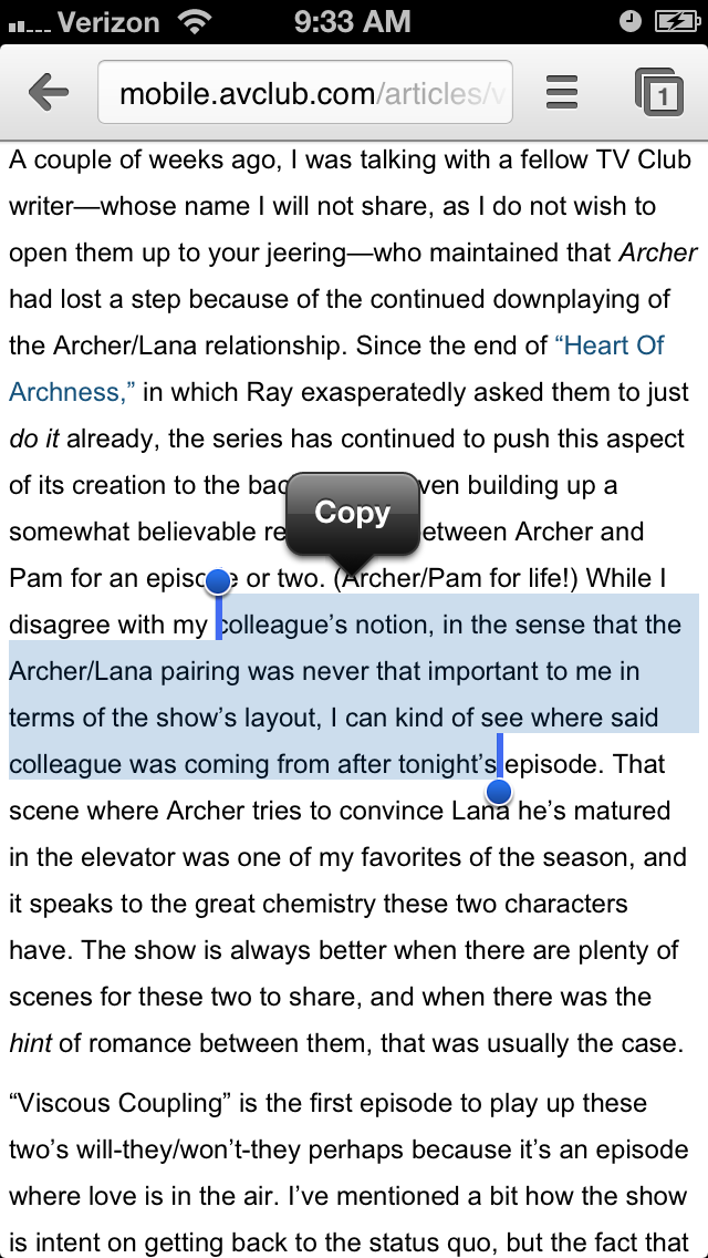
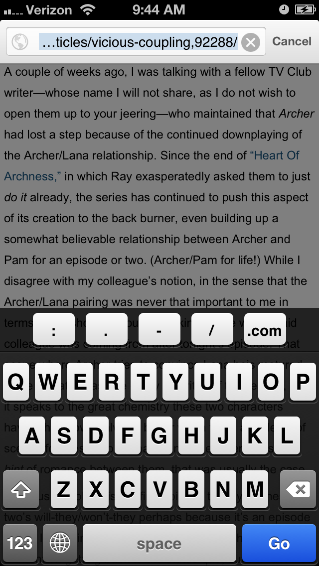
The ability to pin folders to Windows Explorer's Jump List is something that's become a seamless part of my computing routine. Pinning items to Jump Lists is easy -- simply drag a folder to Explorer's Taskbar icon, or pin an item that's already in the list of frequently used folders. However, there's a problem.
Windows Explorer also includes a separate list of favorite folders within the application itself. This Favorites list is completely separate from the list of pinned items in Explorer's Jump List. My question is: why use two lists? Why not keep these lists synchronized?
My argument in favor of synchronization is that users probably want the same set of folders available for frequent access, whether they're inside Explorer or outside it. Having to curate two lists is extra work, and will probably lead to one list or the other not being used at all. (Personally, I rarely find myself modifying the Favorites list within Explorer.)
I'm not necessarily right about this, however -- debates in usability are best settled with empirical evidence. It could turn out that users do not in fact want these two lists to be synchronized. However, if I had to guess, I'd say this is simply evidence that the finer intricacies of how different parts of the UI could interact have not been thought through. (Note that although my screen captures are from Windows 7, I checked, and the same situation exists in Windows 8 as well.)
What would I do about this, given the chance? I'd gather usage data from users in the wild, seeing how they use these lists. For a given user, I predict one of the following outcomes:
 |
| The Jump List for Windows Explorer. Pinned folders are at the top; other frequently used folders are below. |
 |
| Pinned items for Windows Explorer. |
 |
| Another list? What now? |
My argument in favor of synchronization is that users probably want the same set of folders available for frequent access, whether they're inside Explorer or outside it. Having to curate two lists is extra work, and will probably lead to one list or the other not being used at all. (Personally, I rarely find myself modifying the Favorites list within Explorer.)
I'm not necessarily right about this, however -- debates in usability are best settled with empirical evidence. It could turn out that users do not in fact want these two lists to be synchronized. However, if I had to guess, I'd say this is simply evidence that the finer intricacies of how different parts of the UI could interact have not been thought through. (Note that although my screen captures are from Windows 7, I checked, and the same situation exists in Windows 8 as well.)
What would I do about this, given the chance? I'd gather usage data from users in the wild, seeing how they use these lists. For a given user, I predict one of the following outcomes:
- The user uses both Pinned Folders and Favorites actively, and keeps them synchronized (or attempts to).
- The user uses both Pinned Folders and Favorites actively, but makes no attempt to keep them synchronized -- each list is radically different, and the user doesn't attempt to change this.
- The user uses only Pinned Folders.
- The user uses only Favorites.
- The user uses neither.
(Naturally, a user's tendencies in this regard are not static -- one of these conditions could easily morph into another one over time.)
Depending on how many users exhibit each of these conditions, I'd take one of the following actions in the next version of Windows:
- Remove the Favorites list.
- Synchronize the Favorites and Pinned Folders lists.
- Provide the option to keep the two lists synchronized, leaving it up to the user.
This is a design oversight; however, I've also had problems with the implementation of Jump Lists. For instance, for a very long time, the Jump List for Microsoft Word would not work -- the Pinned and Frequently Used lists didn't show up, and items couldn't be pinned. That's unacceptable for first-party software. Also, Windows forgets the contents of all my Jump Lists every now and again, entirely out of the blue. I have no idea why. This sort of unreliability diminishes the amount of effort I'm willing to put into using a feature -- since the last time this happened, I've made less of an effort to curate Pinned Items.
Issues like this aren't quite the same as the synchronization issue. However, they all demonstrate that even conceptually strong features like Jump Lists need to be well thought out and properly tested in order to succeed.