Thursday, March 21, 2013

HomeGroup sharing issue on Windows

On both Windows 7 and Windows 8, when you set a folder to be shared with your Homegroup, the status window for the operation pops up in the background, with no obvious indication that anything has happened unless you examine the Windows Explorer icon on the Taskbar.

The first time I tried changing sharing settings on a folder, this confused me. Since there was no obvious feedback, I thought nothing had happened. I tried again, and discovered that there were two windows trying to do the same operation in the background.

This is an odd oversight, and one that was obviously carried over from Windows 7 to Windows 8. Either nobody spotted it, or nobody considered it important enough to fix.

But it is important. Whenever a user performs an action using an interface, that action's consequences should be clear. With something like a light switch, the consequences are obvious. But when the consequences are less tangible, explicit feedback helps make them clear.

Sharing folders with your Homegroup is an action with less tangible consequences. However, those consequences are of great import, since they involve sharing folders across a network. Therefore, the feedback should be made especially visible. The status window for sharing the folders should be brought up in the foreground, and not the background. This is a minor issue, but one I consider important.

UPDATE: After exploring the issue a little further, I found that the status window only shows up occasionally -- a lot of the time, the sharing operation completes with no feedback at all. This is much worse. A feedback window saying "The following items have been shared with your Homegroup" is something I'd consider mandatory, because sharing folders across a network is a security-sensitive action. But as I said earlier, every action you take when using an interface should provide some sort of feedback, in order to make its consequences clear.

Tuesday, March 5, 2013

Scrolling oddity in Microsoft Word

If you open a web-downloaded document in Microsoft Word 2010 for the first time, it opens in a read-only mode called Protected View. Pressing 'Enable Editing' permanently switches the document to read/write mode.
A web-downloaded document opened in Protected View.
On the other hand, a document created on your PC opens directly into read/write mode from the start.
A document created locally, opened in read/write mode.
There's a subtle inconsistency in scrolling behavior between the two modes. After opening a document in Protected View, you cannot scroll the text using the keyboard (the directional keys, PgUp/PgDn, Home/End) without clicking on it first. (You can't use Tab to shift focus to it either). On the other hand, a document opened in read/write mode can be immediately scrolled using the keyboard.

I'm not sure why this is. Protected View does have heavy restrictions -- you can't print unless you enable editing, for instance, despite printing being an ostensibly read-only action. But I think this is more likely a minor UI programming inconsistency. If that's the case, correcting it shouldn't be too difficult.

I realize this is a minor issue, and one that seems almost frivolous to write about. But as a teaching assistant, I often need to open dozens (if not hundreds) of documents downloaded from the Internet, and at that scale, an issue like this can become noticeable.

Little issues of this sort have an effect on the smoothness, polish, and comfort of a UI. I don't know if Word's development team would consider this an important enough issue to fix. But fixing it would increase the application's usability, if only by a little. Fixing several such issues would increase the usability a lot.

Sunday, March 3, 2013

Problems with auto-expand web views

In a previous post (Facebook footer links), I mentioned auto-append views: information views that automatically expand to display additional content when the user reaches the end of the currently-displayed content. More generally, views that append additional content to the content currently displayed, instead of splitting content into multiple pages, have become rather popular recently. (There are both manually-appending and automatically-appending versions of these.) Let us call these append views.
The button for appending additional content to a Yammer news feed.
I consider append views to have the following problems:

  • An append view gets bigger and more unwieldy as more content is appended to it. Getting around the content requires a lot of scrolling. (On the other hand, navigating multiple pages of content can be done using clicking. I'd need to do tests to see which method is more efficient.) Furthermore, bigger pages are harder for resource-limited browsers (such as smartphone browsers) to handle -- in my experience, they can slow such browsers down. Google Chrome on my iPhone has occasionally crashed while trying to display large append views.
  • Append views often break web history navigation. Since they tend to be presented on a single webpage using HTML5 techniques, instead of on multiple pages, append views possess a specific piece of state information: how much content is currently being displayed. This state information isn't stored as part of a browser's web history, which is why navigating back to one of these views usually requires the user to append the same content again.

    On the other hand, multiple pages of content are usually displayed as separate webpages, with separate URLs, so that the browser doesn't need to remember any additional state information in order to accurately return the user to the specific page he was at previously. (Note that I've seen multi-page displays implemented using HTML5 on a single webpage, in which the case the same issue might apply.)
  • Because append views are often presented on a single page, it usually isn't possible to provide a link to a specific portion of the content (such as the fifth page of content, for instance). (Note that this can also be a problem for multi-page displays, since their pages are often numbered from the most recent one, so that the page number for a given page of content could change, as could the set of items grouped together on a single page.)
What improvements would I make to append views? I'd find a way to make browsers remember how much content has been loaded into a particular append view, either through session variables or URLs. URLs would also be an easy way for users to create links to specific views of content.

Friday, February 22, 2013

Unsynchronized folder lists in Windows

In Windows 7, Microsoft introduced a new design for the Taskbar. One of its best features, in my opinion, is Jump Lists.
The Jump List for Windows Explorer. Pinned folders are at the top; other frequently used folders are below.
A Jump List is a list of relevant commands an application can perform, brought together in a list that's directly accessible from the application's icon in the Taskbar (and also in the Start Menu). Application developers can customize the list, but even if they don't, two things are available by default: a list of frequently used files, and a persistent list where users can 'pin' files they want easy access to.
Pinned items for Windows Explorer.
The ability to pin folders to Windows Explorer's Jump List is something that's become a seamless part of my computing routine. Pinning items to Jump Lists is easy -- simply drag a folder to Explorer's Taskbar icon, or pin an item that's already in the list of frequently used folders. However, there's a problem.
Another list? What now?
Windows Explorer also includes a separate list of favorite folders within the application itself. This Favorites list is completely separate from the list of pinned items in Explorer's Jump List. My question is: why use two lists? Why not keep these lists synchronized?

My argument in favor of synchronization is that users probably want the same set of folders available for frequent access, whether they're inside Explorer or outside it. Having to curate two lists is extra work, and will probably lead to one list or the other not being used at all. (Personally, I rarely find myself modifying the Favorites list within Explorer.)

I'm not necessarily right about this, however -- debates in usability are best settled with empirical evidence. It could turn out that users do not in fact want these two lists to be synchronized. However, if I had to guess, I'd say this is simply evidence that the finer intricacies of how different parts of the UI could interact have not been thought through. (Note that although my screen captures are from Windows 7, I checked, and the same situation exists in Windows 8 as well.)

What would I do about this, given the chance? I'd gather usage data from users in the wild, seeing how they use these lists. For a given user, I predict one of the following outcomes:
  1. The user uses both Pinned Folders and Favorites actively, and keeps them synchronized (or attempts to).
  2. The user uses both Pinned Folders and Favorites actively, but makes no attempt to keep them synchronized -- each list is radically different, and the user doesn't attempt to change this.
  3. The user uses only Pinned Folders.
  4. The user uses only Favorites.
  5. The user uses neither.
(Naturally, a user's tendencies in this regard are not static -- one of these conditions could easily morph into another one over time.)

Depending on how many users exhibit each of these conditions, I'd take one of the following actions in the next version of Windows:
  • Remove the Favorites list.
  • Synchronize the Favorites and Pinned Folders lists.
  • Provide the option to keep the two lists synchronized, leaving it up to the user.
This is a design oversight; however, I've also had problems with the implementation of Jump Lists. For instance, for a very long time, the Jump List for Microsoft Word would not work -- the Pinned and Frequently Used lists didn't show up, and items couldn't be pinned. That's unacceptable for first-party software. Also, Windows forgets the contents of all my Jump Lists every now and again, entirely out of the blue. I have no idea why. This sort of unreliability diminishes the amount of effort I'm willing to put into using a feature -- since the last time this happened, I've made less of an effort to curate Pinned Items.

Issues like this aren't quite the same as the synchronization issue. However, they all demonstrate that even conceptually strong features like Jump Lists need to be well thought out and properly tested in order to succeed.

Friday, February 15, 2013

Odd URL selection behavior in Chrome on iOS

Chrome on iOS uses a combined search/URL bar, just like the full version of the browser. However, there's a bug in the implementation that makes copying URLs a tiny bit more annoying.

Normally, on iOS, selecting text automatically brings up a set of options for what to do with it. In text-entry fields, you can cut, copy, and paste over the text, and in read-only text displays, you can copy the text.
Selection options for a text-entry field.
Selection options for a read-only text display.
When you tap the URL bar on Chrome, the entire contents of the bar get selected. (In my experience, this is standard behavior on most desktop browsers.) However, in this case, Chrome doesn't display any options.
Where'd the options go?
The only way I know of to bring the options up is to tap the bar again, which deselects everything; tap once more, which brings up text selection options; and then tap the 'Select All' option, which finally selects the entire contents of the URL bar while providing options for what to do with the selection.
Tap once to deselect...
Tap again to bring up selection options...
Tap 'Select All' to select the URL...
Finally, the options you wanted in the first place.
The whole process takes 4 taps, when it really ought to take just 1.

This can be really annoying when you're trying to copy multiple URLs (to share by email, for instance). It's a small bug, and so it ought to be easy to fix.

Update: I've found another way to select the entire URL: tap and hold the URL bar. This selects the entire URL, and brings up a list of options for text selection. Tapping 'Select All' then keeps the text selected, and gives you options for using the selected text.
Tap and hold the URL...
Tap 'Select All'...
The options are now available.
The odd thing about this, however, is that tapping and holding the URL selects the text, while also asking whether the user wants to select text. In order to be consistent with standard selection behavior, Chrome should display the list of actions that can be performed on the selected text ('Cut', 'Copy' and 'Paste') instead.

Monday, February 4, 2013

Facebook footer links

This is a rather daft usability oversight, to be honest. It concerns the set of footer links at the bottom of all Facebook pages.

This is what they look like:
Facebook footer links.
You'll notice I've taken this screenshot from Facebook's privacy settings page. The reason for this is that on the primary Facebook pages, Facebook actively prevents me from seeing these links.

Facebook's primary views (the News feed, Friend and Page Walls, Photo albums, etc.) display information feeds filled with a massive number of items. Obviously, trying to display these contents all at once is futile; therefore, Facebook displays them a few at a time. Good strategy so far.

When you reach the bottom of the current view of a feed, Facebook automatically lengthens the view, adding items from further back in the feed. (For convenience, let's call this type of view an auto-append view.) This has become a popular way of displaying feeds on the Web, recently. I have a few issues with this method; however, that's something I'll talk about later. The problem here is this: even while displaying auto-append views, Facebook still displays its footer links. You get to see them for about three seconds, before Facebook expands the feed, pushing the footer further down.

Now you see it...

...and now you don't.
It does this every time I scroll to the bottom, no matter what method I use (arrow keys, 'End' key, mouse scrolling). It's as if Facebook is playing keep-away with a piece of its UI, and it's aggravating.

You could argue that the links are accessible if you access a Facebook page that isn't an auto-append feed (like the settings page); however, I shouldn't have to visit another page in order to click on links that are clearly there on the front page. Furthermore, although two of the links in the footer ('Help' and 'Create an Advert') are available from the settings menu (which is a persistent part of Facebook's chrome), most of them aren't -- in fact, I haven't been able to find them anywhere else on the front page or in the chrome. (Confusingly, 'Privacy Settings' in the settings menu and 'Privacy' in the footer lead to different places. Meanwhile, 'Advertise on Facebook' and 'Create an Advert' lead to pages that are identical, except for slightly different title formatting. It's weird.)
The settings menu provides access to a different set of functions.
Even if the footer links were replicated exactly in an accessible part of the website, however, it would still be a problem. After all, how do I know the footer links are replicated if I can't see them? For all I know, there might be unique links down there that Facebook simply isn't letting me see. (Which it turns out there are.)

It's baffling that Facebook could leave a mistake like this on its website for so long. How would I fix it? One option would be to make feed views not automatically expand -- that way, anything at the bottom would be accessible. However, that would interfere with a feature (auto-expand views) that many users might like. (Personally, I think there needs to be a better system than append-based feeds, since they tend to get unwieldy, but that's a discussion for later on.)

I think the best method would be to incorporate the footer links into the persistent website chrome. They're clearly meant to be persistent, since they appear on every page; however, Facebook already has a place for displaying features persistently, and that's where these links should appear. (I wouldn't cram them all in the settings menu; instead, they should be divided into logical categories and grouped appropriately, perhaps using separate menus.) There's a rule here: if an information feed (or other information display) is going to expand into a space, don't put anything else important in that space. It'll simply disappear.

Tuesday, January 29, 2013

Cool iOS usability improvement

Apple just fixed a rather irritating usability issue on iOS. This relates to the placement of the playback buttons on the iPhone lock screen.


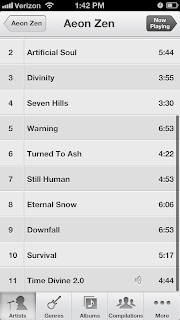
On the regular music player application, the buttons are placed far apart, as seen below.


(It looks like the buttons are right next to each other. However, the blank space is actually non-functional -- you have to touch the symbols in order to trigger playback functions.)

However, in previous versions of iOS, the playback buttons on the lock screen were closer together, as seen on this screenshot from my wife's phone.

This meant that I frequently pressed the 'previous track' button when I wanted to press the 'pause' button. This is a destructive action, since the music player would forget my place in the current track and go back to the start. This made pausing the music from the lock screen a delicate operation. Habits learned while using the main application could not be applied while using the lock screen -- I couldn't use the same estimate for the horizontal position of the 'pause' button, despite the fact that the button has the same purpose and the same effect, no matter which screen I'm on.

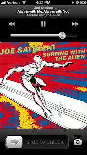
This is something I'd been planning to write about. However, I'm happy to report that Apple have fixed this issue with their latest iOS update. This is a screenshot of the current lock screen.


The controls are further apart, reducing the chance of hitting the wrong button. Also, the visual consistency between the two screens is an aesthetic improvement.

Of course, the vertical position of the buttons is still different. This has never been a problem for me; however, you'd have to perform tests in order to determine whether or not this causes problems for users in general.

There's also the fact that the buttons are quite small -- Fitts's law (roughly) states that the time taken to hit a target is inversely proportional to the size of the target. (It also states that the time is directly proportional to the distance to the target, but this is less of an issue for small touch screens, where all targets are the same distance from the user, unless the user is dragging his finger.) Applying this law, we see that in theory, the buttons would be easier to hit if they were bigger (ie. if the blank space between them was actually functional).

However, I've never actually had a problem hitting the playback buttons while in the main application, despite their small size. Furthermore, since two of the three playback buttons have destructive effects, it might not be a good idea to make them too easy to trigger. Should the buttons be bigger? Again, you'd need to run tests to find out.

I realize that this seems like a tiny issue to quibble over. However, in daily use, small issues like this one can have a major effect on the usability of an interface (especially if there are multiple issues whose effects add up). Furthermore, these issues can leave a negative impression of the 'fit and finish' of an interface.

It's good to see this issue fixed.

Saturday, January 26, 2013

An issue with iOS's music player

There's a problem with iOS's music player (on small form-factor devices, specifically) that trips me up from time to time. I thought I'd write about it.

Suppose I'm at the Now Playing screen, and I want to go back to the list of Artists. To do this, I must repeatedly press the Back button. This is in the top left corner.

You'll notice the Back button has now been contextually modified to indicate its destination. However, its function and its location remain the same.

Again, the Back button stays in the same location.

Now, however, the Store button to take me to iTunes is in the same place as the Back buttons from the previous screens.

This is a problem. Since I frequently perform this sequence of actions, my habit is to press the Back buttons rapidly -- which occasionally makes me press the Store button once I've reached the top level. This is a heavyweight action that takes me to an entirely different application.

I must then find another way back to the Music player.

How would I fix this? I'd start by making the space in the top-level screens previously occupied by Back buttons non-functional, so that pressing it doesn't do anything at all when I'm in a top-level screen.

This also provides the opportunity to fix another issue. Why should the iTunes store only be accessible from top-level screens? The desire to buy new music could strike at any time. Therefore, if the Music player needs to have a link to iTunes, it might as well be included in all of the player's menu screens, instead of just the top-level ones.

The obvious place to put such a persistent link would be in the group of persistent buttons at the bottom of the screen. However, since an external link to iTunes is conceptually different than the other buttons (which simply present different views of my music collection), it ought to be distinguished from them somehow. I'd probably do this by changing its color.

I suppose the icon should be prettier though.

This is a specific instance of a general issue -- that of habituation. Users tend to form habits (such as the habit of rapidly clicking similar buttons), and interfaces should account for this tendency, instead of punishing users for it. This blog post from A List Apart discusses the topic.