Apple just fixed a rather irritating usability issue on iOS. This relates to the placement of the playback buttons on the iPhone lock screen.
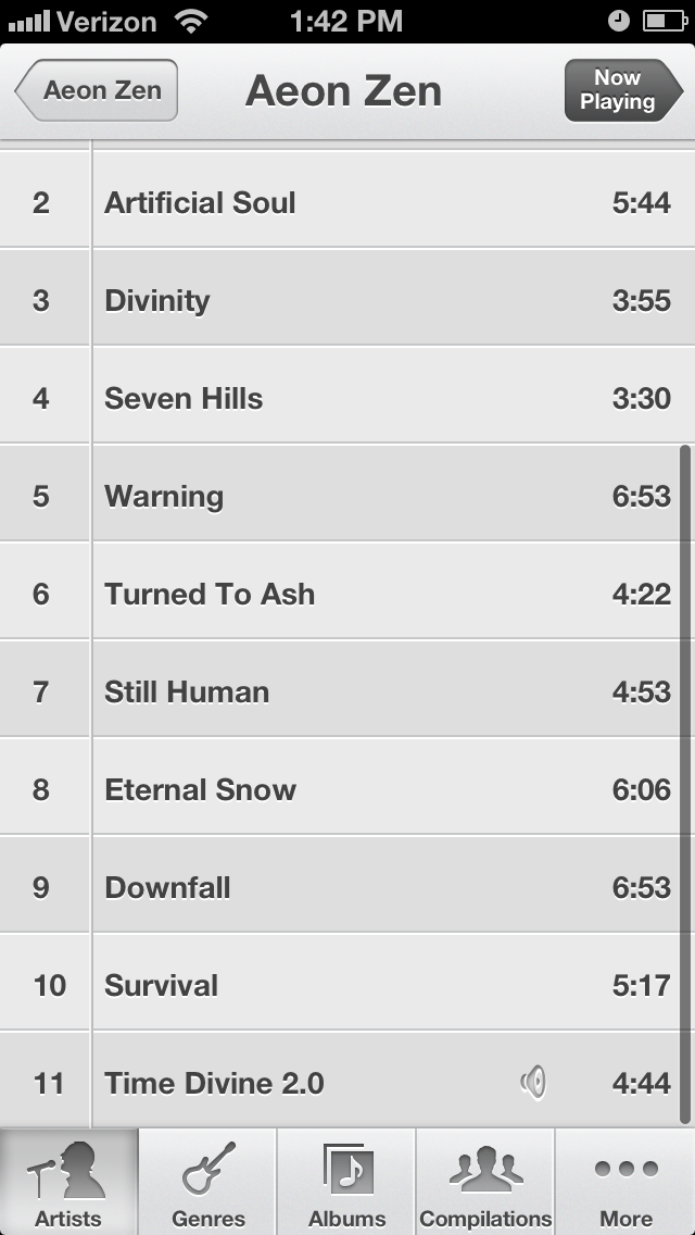
On the regular music player application, the buttons are placed far apart, as seen below.

(It looks like the buttons are right next to each other. However, the blank space is actually non-functional -- you have to touch the symbols in order to trigger playback functions.)
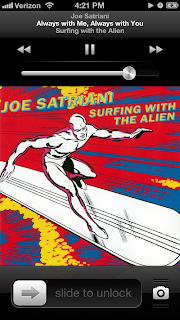
However, in previous versions of iOS, the playback buttons on the lock screen were closer together, as seen on this screenshot from my wife's phone.

This meant that I frequently pressed the 'previous track' button when I wanted to press the 'pause' button. This is a destructive action, since the music player would forget my place in the current track and go back to the start. This made pausing the music from the lock screen a delicate operation. Habits learned while using the main application could not be applied while using the lock screen -- I couldn't use the same estimate for the horizontal position of the 'pause' button, despite the fact that the button has the same purpose and the same effect, no matter which screen I'm on.
This is something I'd been planning to write about. However, I'm happy to report that Apple have fixed this issue with their latest iOS update. This is a screenshot of the current lock screen.
The controls are further apart, reducing the chance of hitting the wrong button. Also, the visual consistency between the two screens is an aesthetic improvement.
Of course, the vertical position of the buttons is still different. This has never been a problem for me; however, you'd have to perform tests in order to determine whether or not this causes problems for users in general.
There's also the fact that the buttons are quite small -- Fitts's law (roughly) states that the time taken to hit a target is inversely proportional to the size of the target. (It also states that the time is directly proportional to the distance to the target, but this is less of an issue for small touch screens, where all targets are the same distance from the user, unless the user is dragging his finger.) Applying this law, we see that in theory, the buttons would be easier to hit if they were bigger (ie. if the blank space between them was actually functional).
However, I've never actually had a problem hitting the playback buttons while in the main application, despite their small size. Furthermore, since two of the three playback buttons have destructive effects, it might not be a good idea to make them too easy to trigger. Should the buttons be bigger? Again, you'd need to run tests to find out.
I realize that this seems like a tiny issue to quibble over. However, in daily use, small issues like this one can have a major effect on the usability of an interface (especially if there are multiple issues whose effects add up). Furthermore, these issues can leave a negative impression of the 'fit and finish' of an interface.
It's good to see this issue fixed.
On the regular music player application, the buttons are placed far apart, as seen below.

(It looks like the buttons are right next to each other. However, the blank space is actually non-functional -- you have to touch the symbols in order to trigger playback functions.)
However, in previous versions of iOS, the playback buttons on the lock screen were closer together, as seen on this screenshot from my wife's phone.

This meant that I frequently pressed the 'previous track' button when I wanted to press the 'pause' button. This is a destructive action, since the music player would forget my place in the current track and go back to the start. This made pausing the music from the lock screen a delicate operation. Habits learned while using the main application could not be applied while using the lock screen -- I couldn't use the same estimate for the horizontal position of the 'pause' button, despite the fact that the button has the same purpose and the same effect, no matter which screen I'm on.

The controls are further apart, reducing the chance of hitting the wrong button. Also, the visual consistency between the two screens is an aesthetic improvement.
Of course, the vertical position of the buttons is still different. This has never been a problem for me; however, you'd have to perform tests in order to determine whether or not this causes problems for users in general.
There's also the fact that the buttons are quite small -- Fitts's law (roughly) states that the time taken to hit a target is inversely proportional to the size of the target. (It also states that the time is directly proportional to the distance to the target, but this is less of an issue for small touch screens, where all targets are the same distance from the user, unless the user is dragging his finger.) Applying this law, we see that in theory, the buttons would be easier to hit if they were bigger (ie. if the blank space between them was actually functional).
However, I've never actually had a problem hitting the playback buttons while in the main application, despite their small size. Furthermore, since two of the three playback buttons have destructive effects, it might not be a good idea to make them too easy to trigger. Should the buttons be bigger? Again, you'd need to run tests to find out.
I realize that this seems like a tiny issue to quibble over. However, in daily use, small issues like this one can have a major effect on the usability of an interface (especially if there are multiple issues whose effects add up). Furthermore, these issues can leave a negative impression of the 'fit and finish' of an interface.
It's good to see this issue fixed.