There's a problem with iOS's music player (on small form-factor devices, specifically) that trips me up from time to time. I thought I'd write about it.
Suppose I'm at the Now Playing screen, and I want to go back to the list of Artists. To do this, I must repeatedly press the Back button. This is in the top left corner.

You'll notice the Back button has now been contextually modified to indicate its destination. However, its function and its location remain the same.
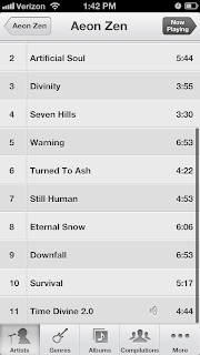
Again, the Back button stays in the same location.

Now, however, the Store button to take me to iTunes is in the same place as the Back buttons from the previous screens.

This is a problem. Since I frequently perform this sequence of actions, my habit is to press the Back buttons rapidly -- which occasionally makes me press the Store button once I've reached the top level. This is a heavyweight action that takes me to an entirely different application.

I must then find another way back to the Music player.
How would I fix this? I'd start by making the space in the top-level screens previously occupied by Back buttons non-functional, so that pressing it doesn't do anything at all when I'm in a top-level screen.
This also provides the opportunity to fix another issue. Why should the iTunes store only be accessible from top-level screens? The desire to buy new music could strike at any time. Therefore, if the Music player needs to have a link to iTunes, it might as well be included in all of the player's menu screens, instead of just the top-level ones.
The obvious place to put such a persistent link would be in the group of persistent buttons at the bottom of the screen. However, since an external link to iTunes is conceptually different than the other buttons (which simply present different views of my music collection), it ought to be distinguished from them somehow. I'd probably do this by changing its color.

I suppose the icon should be prettier though.
This is a specific instance of a general issue -- that of habituation. Users tend to form habits (such as the habit of rapidly clicking similar buttons), and interfaces should account for this tendency, instead of punishing users for it. This blog post from A List Apart discusses the topic.
Suppose I'm at the Now Playing screen, and I want to go back to the list of Artists. To do this, I must repeatedly press the Back button. This is in the top left corner.

You'll notice the Back button has now been contextually modified to indicate its destination. However, its function and its location remain the same.
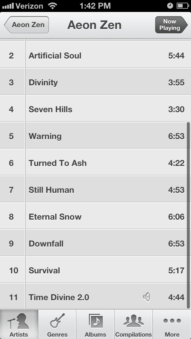
Again, the Back button stays in the same location.

Now, however, the Store button to take me to iTunes is in the same place as the Back buttons from the previous screens.

This is a problem. Since I frequently perform this sequence of actions, my habit is to press the Back buttons rapidly -- which occasionally makes me press the Store button once I've reached the top level. This is a heavyweight action that takes me to an entirely different application.

I must then find another way back to the Music player.
How would I fix this? I'd start by making the space in the top-level screens previously occupied by Back buttons non-functional, so that pressing it doesn't do anything at all when I'm in a top-level screen.
This also provides the opportunity to fix another issue. Why should the iTunes store only be accessible from top-level screens? The desire to buy new music could strike at any time. Therefore, if the Music player needs to have a link to iTunes, it might as well be included in all of the player's menu screens, instead of just the top-level ones.
The obvious place to put such a persistent link would be in the group of persistent buttons at the bottom of the screen. However, since an external link to iTunes is conceptually different than the other buttons (which simply present different views of my music collection), it ought to be distinguished from them somehow. I'd probably do this by changing its color.

I suppose the icon should be prettier though.
This is a specific instance of a general issue -- that of habituation. Users tend to form habits (such as the habit of rapidly clicking similar buttons), and interfaces should account for this tendency, instead of punishing users for it. This blog post from A List Apart discusses the topic.
1 comment:
The entire music app on iDevices is irritating to me. It’s constantly making me click multiple times to do things that should be incredibly simple. Primarily it’s the extra click from “now playing” to “playlist” that annoys me the most. Why in the world do I need a different view for a single song? Furthermore, why do all the playback options change when I turn the device sideways!? I can understand reorganizing them, but removing them and adding totally different options? Gotta say, even though their support is crappy, iriver has far superior interfaces (both hardware and software) for actually listening to music. To be fair, iriver is more an Art company than a Product company…
The simplicity of iDevices is nice. But they’re really starting to push it. The “home” button is practically gesture-controlled these days – I swear if you triple-click it while you have the “running app” taskbar open, you start the incantation used to summon Cthulu. Even the issue you mentioned could be easily mitigated by a hardware “back” button of sorts. (Albeit, Android managed to screw this one up pretty bad, and they’re still in the process of fixing the damage – they had no control over what an app actually used it the button for, and no guidelines about what it was supposed to do.)
-JL
Post a Comment